Hand Lettering Basics: Beginner’s Gentle Guide
Hand Lettering Basics: A Gentle First Step Into Beautiful Words
There’s something magical about turning simple pen strokes into letters that feel alive. This project takes less than an hour, costs almost nothing, and gives you a skill you’ll use for cards, journals, and wall art for years. You don’t need perfect handwriting. You need patience, a willingness to make wobbly lines, and the joy of watching your own rhythm appear on paper. Let’s begin.
Materials List
- Pencil (any HB or 2B — a mechanical pencil works great too)
- Eraser (the softer, the kinder to your paper)
- Ruler (just for guide lines, not for drawing the letters themselves)
- Fine liner pen (0.5mm or 0.8mm — try a felt-tip like a Micron or a cheap rollerball)
- Brush pen (optional but lovely — a Tombow Fudenosuke hard tip is beginner-friendly)
- Smooth paper (printer paper is fine; avoid textured watercolour paper for now)
- Practice grid or plain notebook (dot grid is a dream if you have one)
Short on supplies? Use a biro and the back of an old envelope. Seriously. The tools matter less than your hand learning the shapes. For brush pens, a kids’ watercolour marker with a flexible tip works in a pinch.
Step-by-Step
- Draw your guide lines. Take your ruler and pencil. Lightly draw three horizontal lines: a top line, a middle line (the x-height), and a bottom line. Space them about 2cm apart for practice. For lowercase letters, your ‘a’, ‘e’, and ‘n’ will sit between the middle and bottom lines. Tall letters like ‘b’, ‘d’, and ‘h’ reach up to the top line. Descenders like ‘g’, ‘y’, and ‘p’ dip below the bottom line.
- Warm up with ovals and stems. Before you write a single letter, fill a row with small, loopy ovals — think of drawing the letter ‘o’ over and over but loosely. Then draw vertical lines with a slight curve, like the spine of a ‘b’ or ‘l’. Do this for two minutes. It loosens your wrist, which is where all the magic lives.
- Master the downstroke, upstroke rule. Here’s the secret of hand lettering: thick lines happen when you pull the pen down toward you. Thin lines happen when you push it up. Press harder on the downstrokes, lighter on the upstrokes. With a brush pen, this is natural. With a fine liner, you’ll fake it by drawing two thin lines close together and filling the gap — but for now, just feel the rhythm.
- Write the lowercase alphabet slowly. Start with ‘a’. Move your pen down (press), up (release), down (press), and flick out for the tail. Don’t rush. Each letter should take two to three seconds. Repeat the alphabet three times, focusing on consistent slant — most beginners lean letters to the right, and that’s fine, just keep it uniform.
- Add the uppercase letters. Capital letters use the same pressure rule but take more space. Draw them between the top and bottom lines, ignoring the middle line. Try ‘A’, ‘B’, and ‘C’ first. Notice how the ‘A’ has a thick left leg and a thin right leg — that’s the downstroke/upstroke dance again.
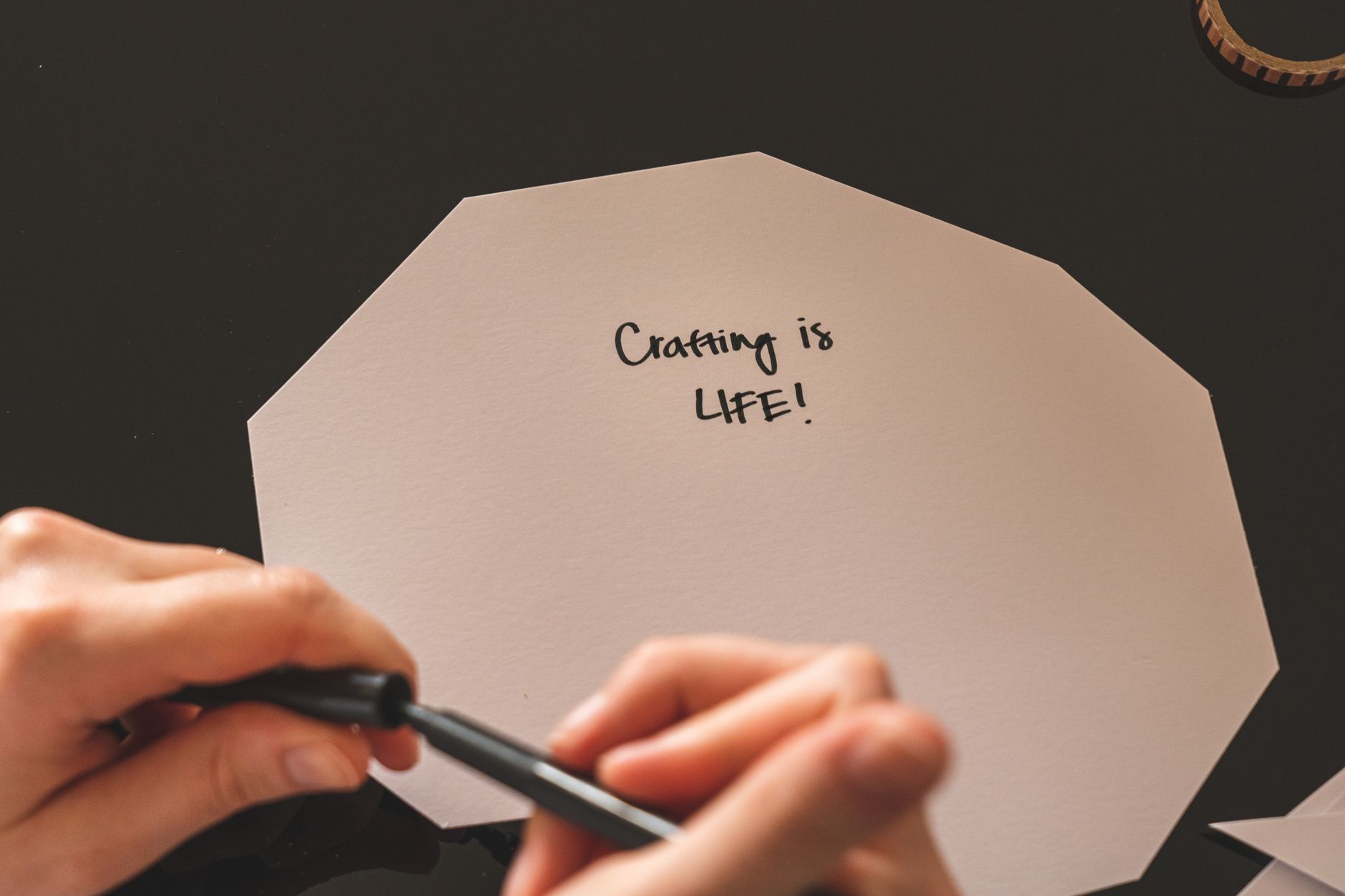
- Letter a real word. Write ‘hello’ in pencil first, using your guide lines. Don’t worry about perfect spacing. Then trace over it with your pen, applying the pressure rule. Let the pencil marks be your safety net. Once the ink dries, erase the pencil gently.
- Add a simple flourish. After your word, draw a small swoosh — a thin upward curve that curls back on itself. Or add a dot above the ‘i’ that’s a tiny circle, not a round blob. This is where personality sneaks in.
[IMAGE: Placeholder for a photo of half-finished practice sheet with guide lines, ovals, and the word ‘hello’ in progress]
Beginner Tips
Your first attempts will look like a spider fell in ink. That’s not failure — that’s data. The biggest mistake beginners make is pressing too hard on upstrokes. You want a feather’s touch there. Another classic slip: drawing letters from the top down every time, which breaks the flow. Always pull down for thick strokes, push up for thin ones.
Don’t compare your ‘s’ to someone’s Instagram-perfect ‘s’. Comparison kills the joy faster than a dry pen. Instead, compare your first ‘a’ to your tenth ‘a’. See that improvement? That’s yours.
One counter-intuitive truth: slow down to speed up. Most people rush because they’re nervous. But hand lettering rewards a glacial pace. Breathe, press, release. Also, skip the grid lines after your second practice session — freehanding teaches your eye to judge spacing better than any ruler. Trust your eye, even when it lies at first.
Keep your pen at a 45-degree angle to the paper. Too upright and you’ll get scratchy lines. Too flat and the ink pools. And never, ever shake your hand out mid-letter — let the wobble happen. Wobbly lines are how you learn control.
Creative Variation
Once you’ve got the basics, try the ‘bounce’ technique. Instead of keeping every letter on the baseline, let certain letters rise slightly above it — like ‘l’ and ‘t’ — and let others sink a touch below, like ‘o’ and ‘n’. This creates that playful, hand-drawn look you see on cafe chalkboards. No two letters need to sit on the same line.
Another fun twist: switch to a coloured brush pen and write your favourite single word on a small piece of card. Then cut around the letters to make a custom gift tag. Or use a white gel pen on black paper — the contrast makes your strokes pop dramatically, and mistakes become less visible because the ink covers them better.
Want a real challenge? Letter the same word ten times, each time changing the size of the x-height. Tiny ‘e’s with giant ‘h’s. It sounds odd, but it teaches you proportion in a way that rigid practice never will. Have you ever tried writing with your non-dominant hand just to feel the shapes differently? It’s messy, but it rewires your brain’s understanding of each letter’s skeleton.
Troubleshooting
If your ink bleeds into the paper, you’re pressing too hard or using paper that’s too absorbent. Switch to a smoother sheet and lighten your touch. If your brush pen tip is fraying, you’re likely twisting it too much — keep the tip flat against the paper, not on its corner.
Tears or smudges? Wait longer for the ink to dry, and rest your palm on a scrap piece of paper under your writing hand. For pencil marks that won’t erase, let the ink dry fully — at least 30 seconds — then use a gentle rubber. If the letters look cramped, add more space between them. Beginners usually squeeze words together because they’re focusing on the letters, not the word as a whole.
When your hand cramps, stop. Shake it out, stretch your fingers, and drink some water. Strain leads to shaky lines. And if a stroke goes wrong mid-letter, don’t try to fix it — start that letter again from scratch. Patching over a mistake makes it twice as visible. Finally, if you’re frustrated with your ‘r’ or ‘k’, write that single letter 50 times in a row. It’s boring, but it’s the fastest cure. Your muscle memory needs repetition, not talent.
Still stuck? Put the pen down for an hour. Walk away. Make a cup of tea. When you come back, your hand will be looser and your eye kinder. It never fails.
Hand lettering isn’t about perfection. It’s about leaving a little evidence of your hand on the page. Every wobble, every too-thick upstroke, every slightly-off baseline — that’s your signature. And the more you practice, the more your signature becomes something you’re proud to sign. So grab your pen, draw those guide lines, and give yourself permission to make messy, beautiful, human marks. Your first word might be shaky. Your tenth will be steady. And your hundredth? That’s where you’ll fall in love.