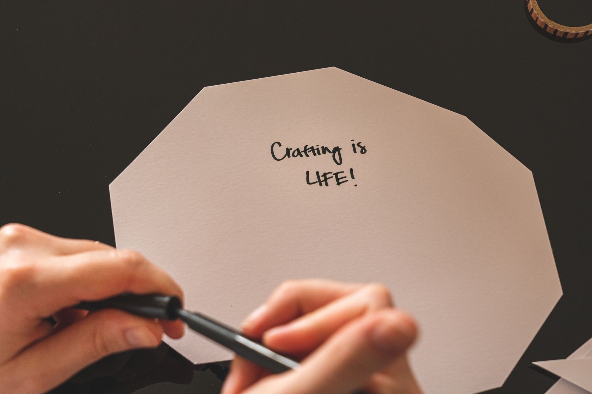
Hand Lettering Basics: A Beginner’s Guide
The nib catches on the paper with a tiny scratch, and the ink pools for half a second before you pull the stroke. That scratch is the sound of learning. I’ve watched hundreds of beginners sit down convinced they have terrible handwriting, and every single one of them produced something worth keeping within an hour. Hand lettering isn’t handwriting, you see. Handwriting is how you write when you’re not thinking about it. Lettering is drawing letters on purpose, one shape at a time, and that changes everything. You can learn to draw letters even if your grocery lists look like a doctor’s revenge.
This tutorial walks you through the basics in a single afternoon. No art school, no expensive kit, no talent required. Just paper, a pencil, and a willingness to draw the same letter badly a few times before it looks good.
Materials List
- Smooth paper. Printer paper works fine to start. Skip textured watercolour paper for now — rough surfaces shred fine tips. A dot grid notebook is lovely if you have one, but plain copy paper is honestly perfect.
- A pencil and eraser. Any standard HB pencil. A white plastic eraser beats a pink one because it lifts graphite without smudging.
- A fine liner. A 0.5mm fineliner is the workhorse of lettering. Alternatives: a gel pen, a biro, or any pen you already own that doesn’t blob.
- A brush pen (optional but fun). A Tombow Dual Brush or a Pentel Fude Touch. Cheaper swap: a Crayola marker with a flexible tip, or a water brush filled with diluted ink.
- A ruler. For drawing guide lines. A cheap plastic one is fine.
- Tracing paper (optional). Great for practising over a printed alphabet without wrecking your original.
Step-by-Step
- Draw your guide lines. Use the ruler to draw three faint pencil lines: a baseline at the bottom, an x-height line above it (about 1cm up for a start), and a cap line above that (another 1cm). These lines are your scaffolding. Every letter sits on them, and they’re why professional lettering looks so tidy. Draw them lightly so you can erase them later.
- Warm up with simple shapes. Before any letters, fill half a page with circles, straight vertical lines, and gentle curves. Ten of each. This isn’t busywork — it trains your hand to make confident strokes instead of shaky ones. Draw from the shoulder, not the wrist, and move faster than feels comfortable. Speed kills wobble.
- Start with the letter “l”. A single vertical stroke from cap line to baseline. Draw it ten times. Then draw “i” — same stroke plus a dot. Then “n”, which is one vertical plus a curve. Build up slowly. The letters with straight strokes come first because they teach you pressure control before you add curves.
- Sketch in pencil first. For every word or phrase, sketch the whole thing in pencil before you touch a pen. This is the step beginners skip, and it’s the step that saves you. Pencil lets you fix spacing, adjust letter widths, and erase the disasters. Only commit to ink once the pencil version looks right.
- Space letters by eye, not by ruler. Equal spacing between letters is a myth. Letters have different shapes — an “i” needs more room around it than an “m”. Aim for visually even gaps, which usually means slightly tighter pairs like “ll” and looser pairs like “io”. Squint at your word from arm’s length to check the rhythm.
- Ink over the pencil. Slow down for this bit. Draw each stroke in one confident motion, starting and finishing where you mean to. If a stroke goes wrong, don’t fix it mid-line — finish it, then redraw the letter beside it. Fineliner ink dries fast, so work left to right if you’re right-handed, right to left if you’re a leftie, to avoid smudging.
- Add weight with a brush pen. Here’s the trick that makes lettering look professional: thin upstrokes, thick downstrokes. When your pen moves upward, use light pressure. When it moves downward, press harder. That contrast is what gives brush lettering its bounce. Practise on a page of simple loops first — up light, down heavy, over and over.
- Erase the guides and admire. Wait until the ink is fully dry (give it a minute), then erase your pencil lines gently. The letters will pop off the page. Date the page and keep it. In three weeks you’ll look back at it and be genuinely surprised.

Beginner Tips
The biggest mistake I see is people trying to write a whole phrase before they can draw a single letter well. Slow down. Master “a” before you attempt “happy birthday”. It feels tedious and it isn’t — it’s how everyone learns.
Second mistake: gripping the pen like you’re holding on for dear life. A death grip makes your strokes shaky and your hand ache. Hold the pen loosely, let it rest against your middle finger, and keep your wrist relaxed.
Third: skipping guide lines because they look fussy. They aren’t decoration — they’re the difference between letters that sit neatly and letters that wander off like sheep. Use them every time until your muscle memory takes over. That takes months, not days, so be patient with yourself.
Fourth: comparing your first attempt to someone’s tenth year. Instagram is full of lettering that took years to master. Your job is to beat yesterday’s version of you, not a stranger’s highlight reel.
Creative Variation
Once you can draw a clean word, try a “bounce” layout. Instead of sitting every letter on the baseline, let them hop up and down slightly — one letter high, the next low, the next in between. Keep the letters touching the baseline loosely, as if they’re bouncing on a trampoline. It looks playful and forgiving, and it hides small spacing errors beautifully. Pair a bouncy word with a simple script underneath for contrast, and you’ve got a greeting card worth framing.
Troubleshooting
My letters are wobbly. Draw bigger and faster. Wobble comes from slow, tense strokes. Try drawing your vertical lines at double size on scrap paper, then shrink back down — your hand will feel the difference immediately.
My spacing looks off. Turn the page upside down and squint. Weird trick, but it works — your brain stops reading the word and starts seeing the shapes, so uneven gaps jump out.
My brush pen strokes are blobby. You’re pressing too hard at the start of the stroke. Begin with light pressure, build through the middle, and ease off at the end. Also check the pen isn’t running dry — a dry brush pen makes you press harder, which makes blobs.
The ink smudged. Lefties, this one’s for you. Work right to left, or place a sheet of scrap paper under your hand as you go. Also give gel pens a full minute to dry before erasing nearby pencil.
You don’t need perfect letters to make something lovely. You need a page, a pen, and twenty minutes of not being too precious about it. Draw your guide lines tonight, fill one page with “l” and “n”, and see how it feels. What’s the first word you’d love to letter?